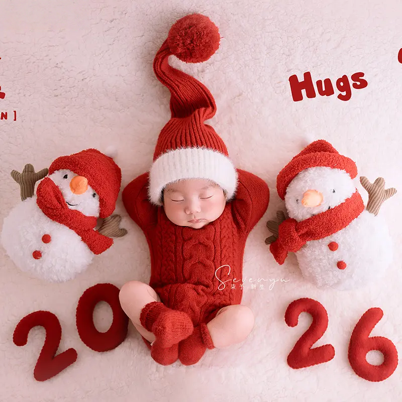
 Prop Guides
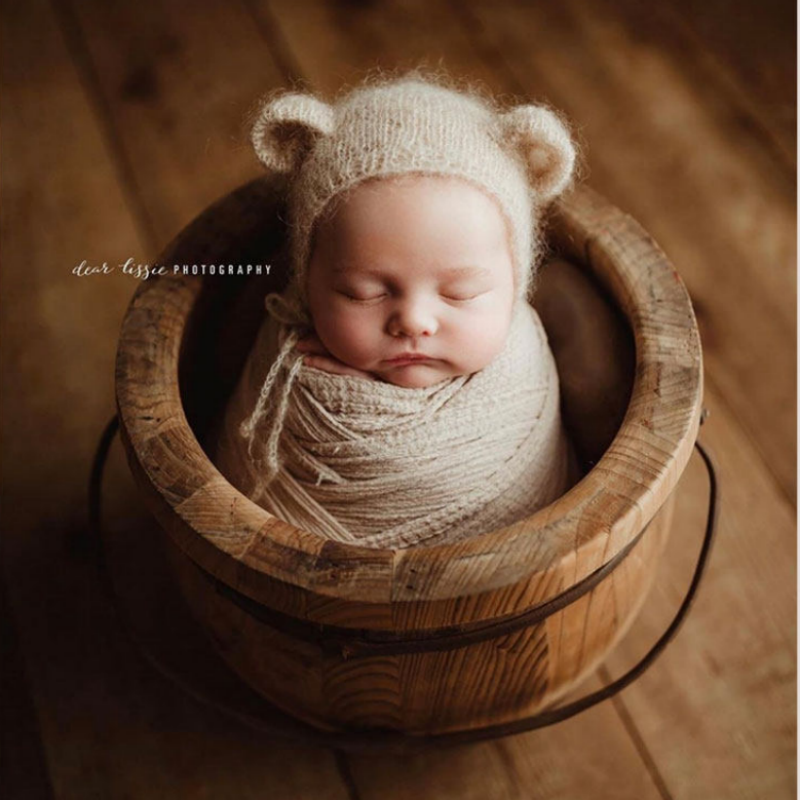
 Best Handmade Knitted Baby Props: Studio Buying Guide
Learn how to evaluate handmade knitted baby props for softness, sizing, construction, photography performance, cleaning and custom studio orders.
Jul 21, 2026 7 min read
Learn how to choose, style and care for newborn photo props with practical guides for professional photographers.
Prop Guides Learn how to evaluate handmade knitted baby props for softness, sizing, construction, photography performance, cleaning and custom studio orders.
 Photography Tips
 Learn how to pose a newborn in a basket with safer prop selection, stable weighting, supportive layering, active spotting and a simple studio workflow.
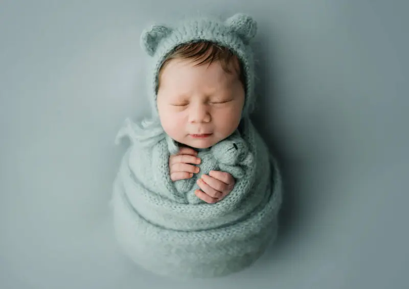
 Photography Tips
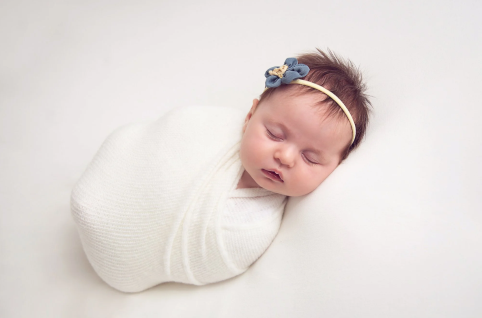
 A photographer-focused guide to wrapping a newborn for photos with breathable layers, a neutral airway, comfortable hips and simple camera-ready styling.
 Prop Guides
 Choose the right newborn photography backdrop size for beanbag portraits, floor scenes, parent photos and wider studio theme sets.
 Photography Tips
 The best time for a baby photoshoot depends on the style you want: sleepy newborn photos, awake baby portraits, tummy-time smiles, or sitter milestone images.
 Photography Tips
 Newborn photos are worth it for many families when the session is safe, simple, and planned around the baby. Here is how to decide before you book.
 Photography Tips
 Newborn photography is important because the first weeks change fast. A calm session records scale, family connection, and the tiny details parents cannot keep any other way.
 Styling Inspiration
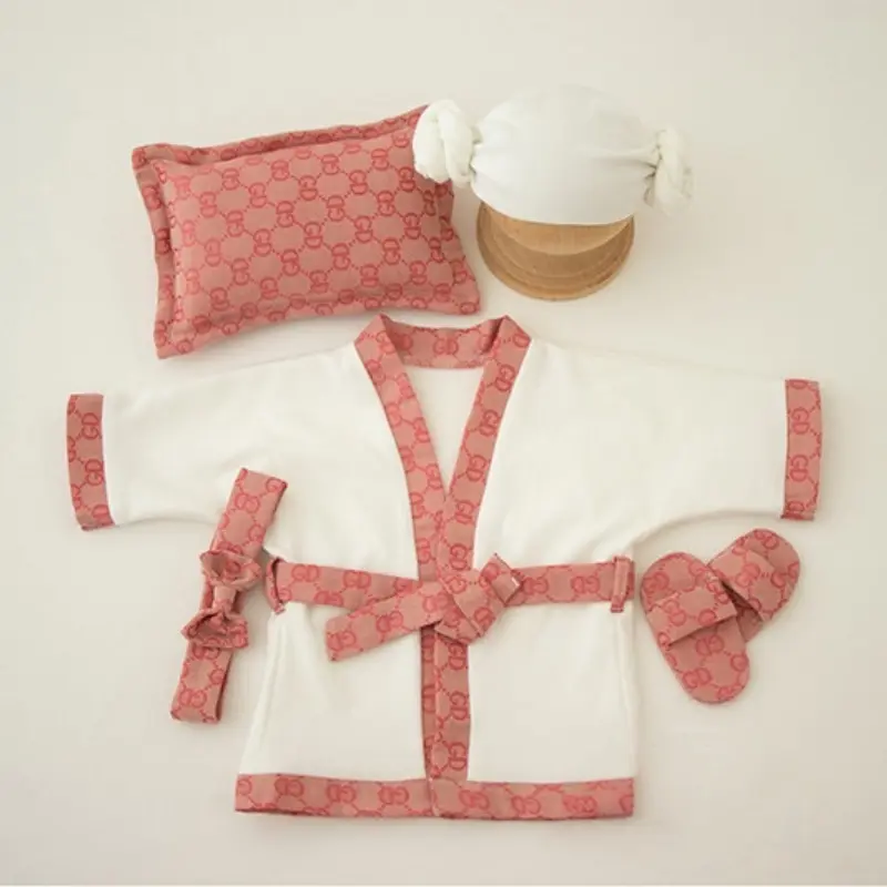
 Looking for an elegant and playful theme for your newborn photography? Discover why the spa day theme is trending in 2026, and see our top pick: the Luxury Gucci-Style Bathrobe Set.
 Styling Inspiration
 Parents often ask for character setups for their newborns. Here is exactly how to style our Zootopia and SpongeBob theme sets without making the scene look overcrowded.
Photography Tips Use this practical newborn prop storage and cleaning checklist to keep your studio props safer, cleaner, and always shoot-ready for newborn sessions in 2026.
 Prop Guides
 Newborn photography theme sets can save setup time or waste shelf space. This is how I choose mini session sets with clear visual stories, fast styling, and better reuse.
Prop Guides A practical 2026 buying guide for newborn photography props: what to buy first, what can wait, and how to build a studio prop collection that photographs well without wasting shelf space.
 Photography Tips
 Learn how to make a baby photoshoot feel calm, safe, and beautiful, from planning the time and light to choosing props, outfits, simple poses, and final details.
 Photography Tips
 Learn how to pose newborns safely with a calm studio workflow, beginner-friendly poses, composite safety rules, prop checks, and a practical session checklist.